Blog, Learn, Post-Production
Post Production: Colour Grading 101
Feb
Colour has the power to communicate different emotions – influencing how people ‘feel’ without them even noticing that the film has been graded with this intention in mind.
Just as Hollywood changes the colour palette of a movie, depending on its genre, we can also make the choice of changing the colour palette of a still image to communicate different emotions to the viewer. The Colorist, who is responsible for the colour ‘grading’ or colour ‘treatment”, will pick the colours carefully in consultation with the Film Director. This is usually decided in pre-production before the sequence is captured. The colour palette chosen will influence the ‘wardrobe’ and ‘props’ departments to ensure all colours carefully align with the emotion to be conveyed.
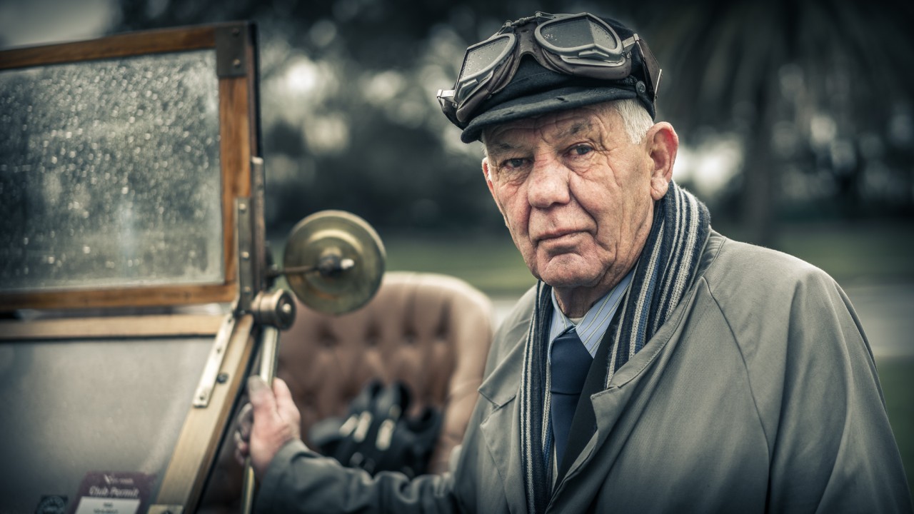
Blue and Orange, mentioned in the movie above, is often referred to as ‘Orange and Teale’ as the Blue tones tend to lean towards Green slightly to compliment the orange tones.
In Lightroom you simple need to go to the Split Tone Panel and dial in a warm colour for the highlights and a cool colour for the shadows. Choosing two colours 180° part will ensure they are complimentary. Start using Saturation values that are very low for stills photos. The Film industry can often get away with heavier saturation levels without the viewer becoming too aware of the colour treatment.
When you get a little bored of safe Orange and Teale colour grading treatments, check out some more Avant Garde films, such as the French film Amélie (a romantic comedy film directed by Jean-Pierre Jeunet).
Check out my FREE Lightroom Presets here: https://www.markgaler.com/product-category/lightroom-presets
One of the creative topics of my one-on-one training sessions and workshops is how to use Lightroom and Photoshop to colour grade your images.